Choosing a kitchen color today does more than refresh a room — it signals lifestyle, affects how foods and finishes look, and can influence a home’s market appeal. As 2026’s design trends shift toward warmer neutrals and richly saturated accents, homeowners face practical choices about light, materials and longevity that matter now more than ever.
Why color selection matters this year
Paint and cabinetry aren’t just aesthetic decisions. With more buyers and renters looking for move-in-ready kitchens, color decisions can have a measurable effect on resale value and perceived maintenance. At the same time, rising interest in sustainable materials means finish type and paint chemistry — low-VOC, durable enamels — are part of the decision, not an afterthought.
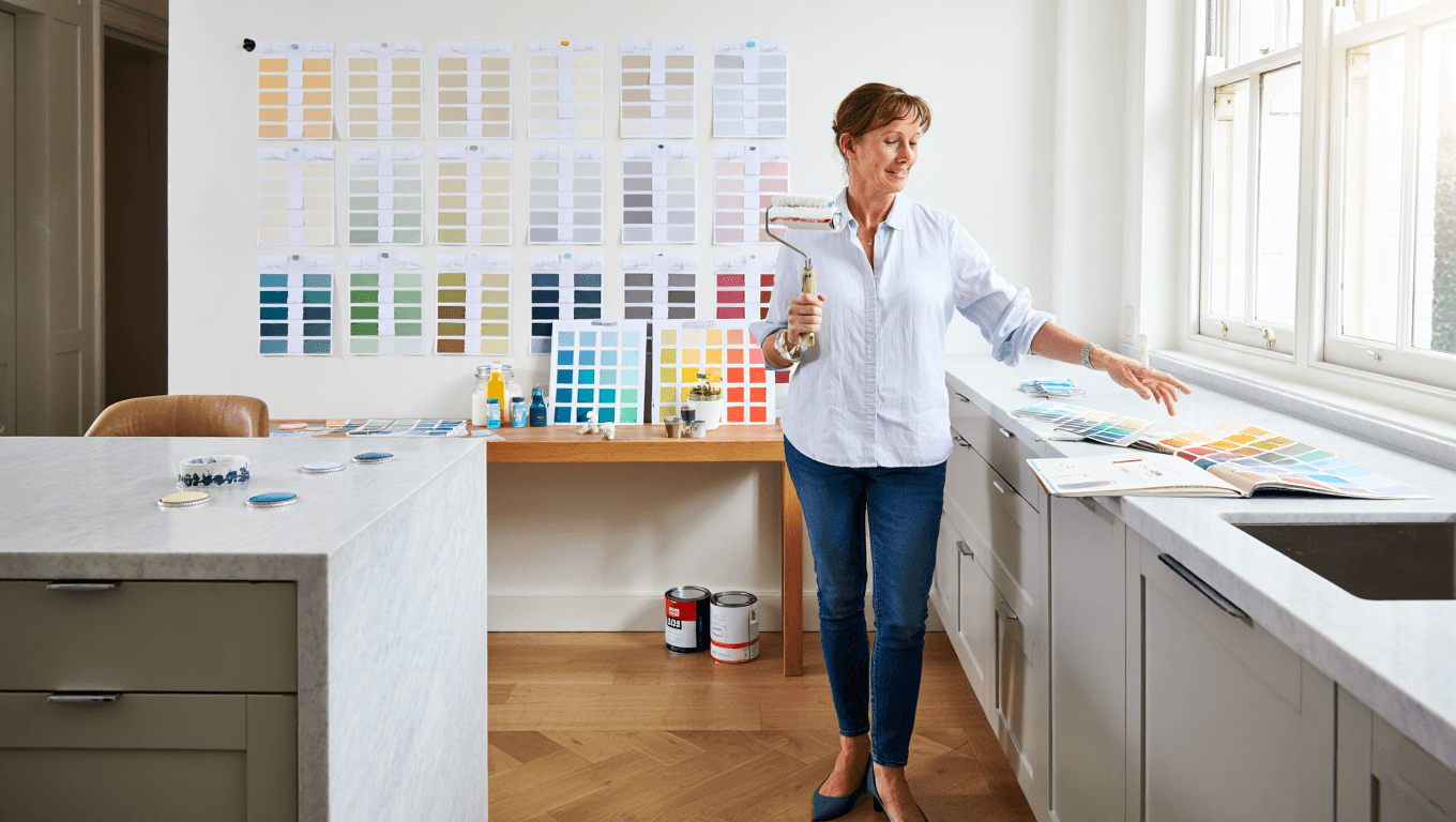
Lighting remains the single biggest variable. A hue that reads warm in morning sun may become flat under artificial light at night. Test samples across the day and with your actual fixtures before committing.
How to pick a color that works
Start by naming the mood you want: calm, energetic, timeless or dramatic. Then map that mood to materials. For example, softer greens pair well with reclaimed wood and matte stone, while deep blues complement polished metals and marble.
Pay attention to undertone — cool vs. warm can change how a color pairs with countertops and floors. Where possible, bring a strip of your countertop material when sampling paint chips so you can compare them under the same light.
- Do test large swatches on at least two walls and observe at morning, midday and evening.
- Do pick one color family for major surfaces (cabinets, island) and a contrasting or complementary shade for accents.
- Don’t rely only on digital swatches; screens distort color temperature and saturation.
- Do consider finish practically: semi-gloss for trim and backsplashes, eggshell or satin for walls, and durable paints for high-contact surfaces.
Color pairings and practical pairings
Two-tone kitchens remain popular because they balance impact with flexibility: a darker island base under lighter perimeter cabinets keeps sightlines open while adding depth. Alternatively, painting upper cabinets lighter than lower ones helps rooms feel taller.
Hardware and fixture metals change the mood of a color. Warm brass lifts ochres and terracottas; chrome and polished nickel sharpen cool greys and blues. Matte black hardware reads modern with deep greens and navy tones.
12 colors that work across styles (and how to use them)
| Color | Mood | Best Pairings | Recommended Finish |
|---|---|---|---|
| Warm White | Crisp, versatile | Oak, marble, brushed nickel | Eggshell walls, semi-gloss trim |
| Soft Greige | Neutral, cozy | Concrete, warm wood, brass | Satin for cabinets |
| Muted Sage | Calming, organic | Terrazzo, matte black, stone | Matte or satin |
| Deep Forest Green | Luxurious, moody | Brass, marble counters, dark wood | Satin or semi-gloss for cabinets |
| Navy Blue | Classic, grounding | White marble, brass, light oak | Semi-gloss for durability |
| Charcoal Black | Contemporary, dramatic | Stainless steel, concrete, pale wood | Semi-gloss to wipe clean |
| Terracotta | Warm, earthy | Raw wood, cream tile, matte black | Matte for walls, satin for cabinetry |
| Powder Blue | Fresh, airy | White ceramic, light wood, nickel | Eggshell on walls |
| Muted Mustard | Energetic, retro | Dark green, walnut, matte black | Satin for accents |
| Soft Blush | Warm, subtle | Marble, brass, pale woods | Eggshell or satin |
| Stone Grey | Understated, modern | Concrete, chrome, oak | Satin for cabinets |
| Olive Brown | Rich, grounded | Textured stone, leather accents, bronze | Matte or satin |
Lighting, finishes and maintenance
High-traffic kitchens benefit from easier-to-clean finishes. For cabinets, choose paints formulated for frequent wiping; for walls, eggshell and satin balance durability with a non-reflective look.
Under-cabinet LED lighting not only improves task visibility but changes how colors read. Cooler temperature LEDs push hues toward blue; warmer LEDs enrich ochres and reds. If you plan to sell in the near term, neutral palettes with a strong accent piece — an island or backsplash — appeal to the widest audience.
Final checklist before you commit
- Paint full-size panels on different walls and evaluate at multiple times of day.
- Match paint to actual materials (countertop, floor, backsplash) rather than to photos.
- Pick durable, low-VOC finishes where possible for indoor air quality and longevity.
- Decide whether the color is permanent (perimeter cabinets) or replaceable (island, open shelving) and invest accordingly.
Color choices shape how your kitchen functions and how it will be perceived months or years from now. Thoughtful sampling, attention to light and pairing with durable materials will ensure the color you pick today stays a winning choice into the future.
Similar Posts
- Paint colors HGTV designers swear by: 12 trending shades to try now
- Paint colors designers recommend to instantly add vintage charm to your home
- Color of 2028 revealed: radiant earth to dominate home and fashion palettes
- Bathroom tile ideas transforming homes now: easy upgrades for any budget
- Designer kitchens: 109 standout ideas to spark your next renovation

A champion of quality and authenticity, Emily delves into Australian-made products and their impact on global markets. With a focus on sustainability, she helps readers understand why these goods are leading the trade world.

